Welcome Innexus Member
Welcome to Marketing4ECPs! Innexus was acquired in 2021, and all account management is now provided through Marketing4ECPs. By merging our networks of resources and expertise, we can even better support you and the growth and profitability of your eye care practice.
Your account managers are here to support you with your marketing strategy and help your practice succeed. If you have a website update or need to speak to your Account Manager, please fill out the form and our team will get back to you.
What We Do
We are known for building the most beautiful and high-converting websites in eye care but also delivering the highest-performing digital marketing services. Every month you will see the data to back that up and numbers on how your website and marketing are performing. No matter your objectives, Marketing4ECPs will help your practice thrive!
We’ve helped 1000+ practices across North America reach their objectives.
Data is Power!
Have you received your 6-month website report? This report contains important information about your website’s performance and how it can be improved. Ready to discuss action items from this report? Contact your account manager so they can review this report with you.

Get Ahead With Your Social Content
Are you trying to keep up with social media posting but missing important dates and opportunities to share content? Fill out the form to access our free Social Media Calendar. You’ll find important days to celebrate on social media so you can stay on top of your social media plan./p>

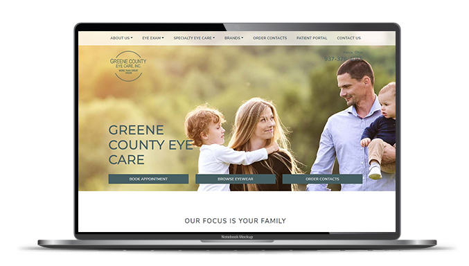
Meet Our New Essential+ Website
Learn how to drive more traffic organically to your website with our NEW Essential+ website.
- Modern Template Website
- Marketing Audit
- Marketing Membership
- Up to 5 pages of custom content and graphics, SEO performance monitoring, and the option to include medical content.
Contact Us
Are you interested in learning more about what Marketing4ECPs can do for your practice? Your account managers are here to support you with your marketing strategy and help your practice succeed. If you need a website update or need to speak to your Account Manager, please fill out the form, and our team will get back to you.
All New Members Receive a Social Media Strategy
Social media is a great way to attract potential patients and engage with current patients to guide them through your sales funnel. With your free social media strategy, you will receive:
- A current audit of your Facebook and/or Instagram accounts
- A competitive analysis
- Content pillar suggestions
- Ideal patient persona evaluation
Are you ready to start engaging on social media? Contact our team and get started today!

Complimentary Website Audit
A website audit can help you identify areas where your site could be improved – from load time and responsiveness to design and functionality. Our free audit checks for all of these factors so you can make your website the best it can be.
You want your website to look great and function perfectly, but sometimes it’s hard to know where to start. That’s why we offer a free website audit – so you can start making your site the best it can be.
Contact us to get your free website audit.
Contact Us
Are you interested in learning more about what Marketing4ECPs can do for your practice? Your account managers are here to support you with your marketing strategy and help your practice succeed. If you need a website update or need to speak to your Account Manager, please fill out the form, and our team will get back to you.

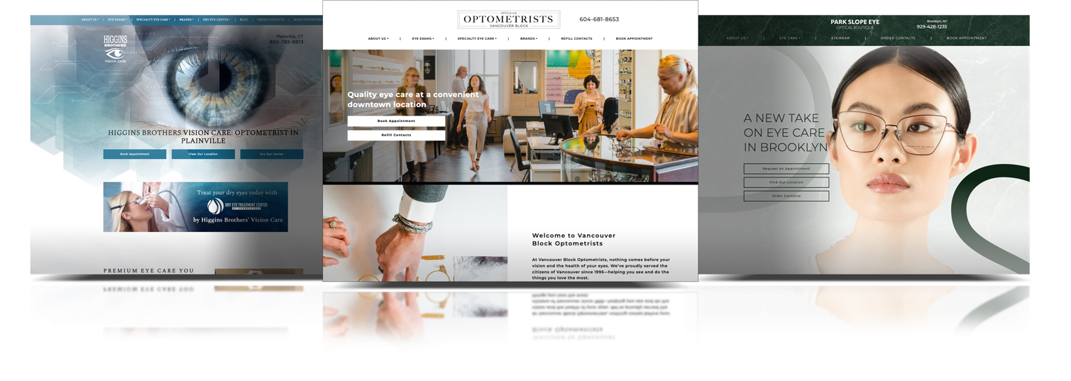
Our Website Products
Essential
Our essential websites are perfect for new start-ups and small practices. If you are ready to create – or upgrade – your online presence and want to get started right away, our essential website is for you.

Essential+
Our essential+ sites are a step up from our essential sites. You’ll get all the ease and speed of our essential sites, but with 5 extra pages of custom content to tell your patients about your specialty or area of focus.

Enhanced
Being the most popular option, our enhanced sites target the 5 sections of your website that are most responsible for driving your revenue. These sites include 5 pages of custom content and a fully customized homepage to showcase your brand and give website visitors something to talk about.
Premium
Our premium sites are custom websites with 20-25 pages of custom medical content, SEO performance monitoring and custom design.

Custom
Custom sites are completely custom sites, and are available only by request.

Enterprise
If you have multiple locations or require multiple websites, our Enterprise option is built for you.

| Essential | Essential+ | Enhanced *MOST POPULAR |
Premium | Custom/ Enterprise |
|
|---|---|---|---|---|---|
|
Marketing Membership |
 |
|
|
|
|
| Marketing Audit |
|
|
|
|
|
|
Website Responsiveness |
|
|
|
|
|
|
Website Accessibility |
|
|
|
|
|
|
Hand Selected Imagery |
|
|
|
|
|
|
Enhanced SEO Framework |
|
|
|
|
|
| Custom Content | – |
(5 pages) |
(5 pages) |
(20 – 25 pages) |
|
|
Enhanced Branded Homepage |
– | – |
|
|
|
|
Enhanced Creative Consultation |
– | – |
|
|
|
|
Full Brand Guidelines |
– | – | – |
|
|
| Premium Design | – | – | – |
|
|
|
Need Something More Specific? |
– | – | – | – |
|
Discover Our Website Solutions

What We Can Do For You
We’ll work with you to build a customized plan that respects your budget, represents your unique practice, and achieves your objectives.
Marketing Membership
Search Engine Optimization
Google Ads
Digital Awareness Ads
Email Marketing
Social Media
Branding
Dry Eye Marketing
Medical Niche Marketing
Partnered With Industry Leaders in Eye Care


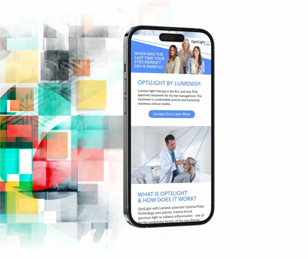
Our Lumenis Partnership
We understand that specializing in a niche service can help elevate your practice – and how it is crucial for your patients to understand what you offer.
Marketing4ECPs’ partnership with Lumenis was developed to support its clients with innovative marketing solutions. We support the marketing behind the OptiLight system, helping practices drive awareness to this specialized treatment and make the most of promoting their investment.
What Industry Leaders Are Saying
Our work speaks for itself, but don’t just listen to us. See what industry leaders have to say!
Why would you do this yourself? The team at Marketing4ECPs is great, and they make all of my marketing look incredible. I love how they incorporated the art around my community into my website.

Dr. Justin Bazan
Park Slope Eye
Thank you to the awesome team @marketing4ecps for making my vision a reality and creating a gorgeous website!

Dr. Mei Fleming
Luminance Vision Optometry
I love my website, and the team at Marketing4ECPs worked alongside me to bring to my vision to life.

Dr. Tanya Gill
Oakland Vision Centre Optometry
We’re super happy and impressed with Marketing4ECPs. The work they create for us is better than anything we could create ourselves.

Dr. Jeff Goodhew & Dr. Tina Goodhew
Abbey Eye Care, Oakville, Ontario
I can’t say enough good things about M4ECPs and what a pleasure it was to work with their team. They genuinely listened to the vision and feel I wanted to create for my practice and their level of detail was exceptional. They were able to bring my vision to life in website format and I cannot recommend them enough!

Dr. Blythe McPherson
Eyes On Westlake
Get In Touch

Website Design
Enhanced Solutions
Marketing4ECPs
- 140 10 Ave SE #1700 Calgary, AB
- T2G 0R1
- Phone: 1-877-707-3459
- Email: [email protected]